The Power of Color: Why Homeowners Must Choose the Right Colors for Their Rooms
Color is one of the most powerful tools in interior design. It can transform a space, evoke emotions, and even influence behavior. Whether you're designing a serene bedroom retreat, an energizing kitchen, or a sophisticated living area, selecting the right colors is essential to achieving the desired ambiance. Understanding color theory helps homeowners make informed choices that enhance aesthetics and improve functionality and comfort. With a strategic approach to color selection, a home can feel more cohesive, inviting, and reflective of personal style.
Color theory is based on how colors interact and their psychological impact. The color wheel is a fundamental tool in design, providing insight into harmonious combinations. It consists of primary colors—red, blue, and yellow—the building blocks for all other hues. When mixed, these create secondary colors—green, orange, and purple. Expanding further, tertiary colors blend a primary color with a neighboring secondary color, such as red-orange or blue-green. Understanding these relationships helps homeowners and designers develop visually appealing and balanced palettes, ensuring each room complements the home's overall design.
Color schemes play a critical role in how a room feels. Complementary colors sit opposite each other on the wheel, creating a dynamic and striking contrast. For example, pairing blue with orange or red with green can produce a bold and vibrant look, perfect for accent walls or feature pieces. Analogous color schemes, composed of hues that sit next to each other on the color wheel, such as blue, blue-green, and green, create a more harmonious and soothing effect, often used in bedrooms and spa-like bathrooms. Monochromatic color schemes, which rely on variations of a single hue, bring a sense of depth and sophistication to a space while maintaining uniformity, making them ideal for contemporary or minimalist interiors.
Pantone Formula Guide Set | Coated & Uncoated
Pantone Connect is the ultimate tool for creative professionals, offering access to 15,000+ up-to-date Pantone colors, seamless Adobe Suite integration, and precise color conversion across formats like RGB, CMYK, and hex. Collaborate effortlessly with team members in real-time, create unique color stories, and ensure consistent color fidelity across projects. Start your free trial today and elevate your designs with the trusted choice of top agencies and brands worldwide! Learn More >
Beyond color relationships, the temperature of color—whether warm or cool—significantly impacts a room's atmosphere. Warm colors, such as reds, oranges, and yellows, exude energy, coziness, and intimacy. They are excellent for social spaces like living rooms, dining rooms, and kitchens, where a sense of warmth and connection is desired. In contrast, cool colors, including blues, greens, and purples, evoke calm, tranquility, and focus. These shades are ideal for bedrooms, offices, and bathrooms, where relaxation and concentration are essential. Homeowners can use color temperature strategically to create the right mood for each room, ensuring that the energy and function of the space align with their lifestyle needs.
The psychological effects of color are profound. Studies have shown that certain colors can affect mood, productivity, and even appetite. Blue, often associated with serenity and stability, is a popular choice for bedrooms and workspaces as it fosters relaxation and focus. Green, a color linked to nature and renewal, brings a fresh and invigorating quality to any space, making it perfect for living rooms and kitchens. Red, known for its intensity and passion, can increase energy levels and appetite, making it a great choice for dining areas. Yellow, with its bright and cheerful nature, enhances positivity and warmth, ideal for kitchens, entryways, and sunlit spaces. Neutrals such as white, beige, gray, and taupe provide a timeless foundation, offering versatility and a sense of sophistication that can be easily adapted to different design styles. By carefully curating colors, homeowners can create a home environment that nurtures their well-being and enhances everyday experiences.
Color also plays a crucial role in spatial perception. Light colors tend to make a room feel larger and more open, while darker shades create intimacy and depth. Soft pastels, whites, or light grays for smaller rooms can create an airy and expansive feel. In contrast, deep blues, greens, or charcoal tones can make a large room feel more grounded and cozy. Additionally, strategically placed color can influence how a space is experienced—painting the ceiling a lighter shade than the walls can create a sense of height. In contrast, an accent wall can add drama and focal interest. Textures and finishes also affect how colors are perceived, with matte surfaces appearing softer and more subdued, while glossy finishes reflect light and add vibrancy.
Our Principal Designer and Color Expert, Cody Sabo, brings years of experience in interior design and a deep understanding of color psychology to create harmonious and balanced interiors. Whether you're selecting paint for a single room or curating a cohesive palette for an entire home, Cody offers expert insight to ensure the final result aligns with your vision. With a tailored approach, he considers factors such as lighting, architecture, and personal preferences to create a beautiful and functional space.
A common challenge homeowners face when selecting colors is understanding undertones. Even neutral colors can have underlying hints of blue, green, pink, or yellow, significantly impacting how they interact with other elements in a room. A gray paint with a blue undertone will create a cooler, more modern aesthetic, while a beige undertone will feel warmer and cozier. Testing samples in different lighting conditions is crucial, as natural light, artificial lighting, and surrounding decor can all influence a color's appearance. Understanding undertones ensures that chosen colors complement each other and contribute to a seamless design.
In addition to wall colors, incorporating color through furniture, textiles, and accessories allows for flexibility in design. A neutral room can be transformed with colorful accents such as throw pillows, rugs, and artwork. This approach is ideal for those who want to experiment with color trends without committing to a permanent change. Seasonal updates, such as introducing warm hues in the winter and cooler tones in the summer, can also keep a home feeling fresh and dynamic. Layering colors through different materials and textures adds depth and richness to a space, making it feel curated and intentional.
Lighting also plays a significant role in how colors are perceived. Natural daylight provides the truest representation of color, while artificial lighting can alter its appearance. Warm incandescent bulbs enhance reds and yellows, while cool LED lights emphasize blues and greens. Homeowners should consider the type of lighting in each room when selecting colors to ensure they achieve the desired effect. Layered lighting, including ambient, task, and accent lighting, allows for greater control over how colors are showcased, enhancing the overall ambiance of a space.
Choosing the right colors, however, can be overwhelming, especially with the countless options available. That's where professional guidance makes all the difference. At Haus of Sabo, we specialize in helping homeowners find the perfect hues to suit their space, style, and needs. Our Principal Designer and Color Expert, Cody Sabo, brings years of experience in interior design and a deep understanding of color psychology to create harmonious and balanced interiors. Whether you're selecting paint for a single room or curating a cohesive palette for an entire home, Cody offers expert insight to ensure the final result aligns with your vision. With a tailored approach, he considers factors such as lighting, architecture, and personal preferences to create a beautiful and functional space.
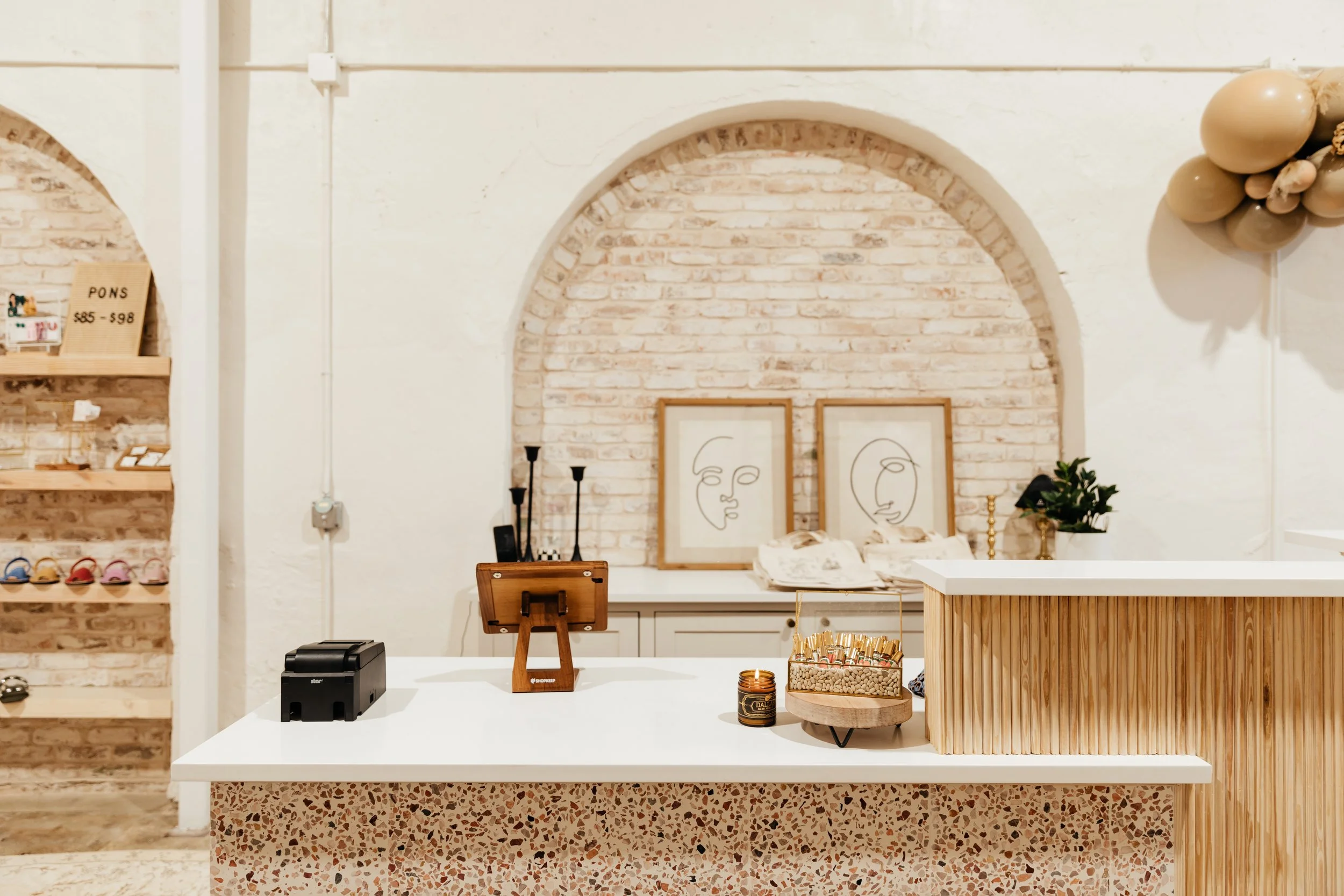
Beauty Grace Lifestyle Shop in Sulphur Springs, Texas
Designed By Cody Sabo Principle Designer at Haus of Sabo
A well-chosen color scheme does more than beautify a home—it enhances its functionality, elevates mood, and even increases property value. With the right approach, color can be a transformative force that turns a house into a true reflection of its inhabitants. If you're looking to refresh your space and unlock the full potential of your home, now is the perfect time to schedule a color consultation with Cody Sabo. Visit Haus of Sabo at our Sulphur Springs or Dallas locations, or book an appointment online to start your journey toward a beautifully designed home.


